


Agape Geriatric Care Logo & Branding
Client
Agape Geriatric Care
Industry
Healthcare / Senior Care
Project Start
4 Desember 2023
Project Finish
15 Desember 2023
Work Scope
Logo system, color & typography, basic guidelines, key collateral
Role
Brand Designer (Strategy + Visual Identity)
Tools
Adobe Illustrator, Adobe Photoshop, Adobe InDesign
If you’re building a healthcare or senior care service and need a brand identity that feels warm, trustworthy, and consistent, I can help—from strategy through a system your team can actually use.
Project Overview
Agape Geriatric Care is a healthcare clinic specializing in geriatric care, focusing on providing professional, compassionate, and human-centered services for elderly patients. While the core service is dedicated to senior care, the brand is strategically designed to also communicate with family members—particularly adult children—who play a key role in decision-making for their parents’ health and wellbeing.
Agape Geriatric Care positions itself as a trusted care partner, emphasizing clarity of information, emotional reassurance, and consistency in service experience. The brand reflects values of sincerity, patience, and dignity, which are essential in long-term elderly care. Through a carefully developed brand identity, Agape Geriatric Care communicates warmth and professionalism simultaneously—bridging medical credibility with emotional trust for both patients and their families.
The Challenge
Geriatric care branding is sensitive by nature: it must feel professional and trustworthy, yet remain warm and humane.
Key challenges:
Balancing medical credibility with emotional trust.
Speaking to two audiences at once: seniors (comfort + readability) and families (confidence + safety).
Building a consistent identity system across touchpoints (clinic, print, and digital) without feeling cold.
Goals
This project was approached as a system, not just a logo.
Create a first impression that feels trusted and professional.
Design visuals that are calm, approachable, and readable for seniors.
Deliver a consistent brand system the team can apply across channels.
Strategi & Direction
Brand attributes: Warm • Dignified • Calm • Clinically credible
Tone of voice: clear, reassuring, grounded—focused on safety, care, and reliability.
Key message (simplified):
For families: “Safe, structured care you can trust.”
For seniors: “Comfortable care with genuine attention.”
Logo Concept

The logo was designed to feel soft yet confident, with a clear silhouette that remains recognizable at small sizes.
What the logo system ensures:
The symbol supports values of care and dignity (not decorative).
Strong legibility for signage, forms, and educational materials.
A complete logo suite: primary, secondary, icon/mark, and mono versions.
Visual System
The identity was built as a cohesive design system.

Color palette
Colors were selected to communicate calmness, cleanliness, and safety, with enough contrast for better readability.

Typography
Type choices prioritize legibility—clear hierarchy, comfortable spacing, and accessible sizing.

Layout & imagery
Layouts are spacious and structured to avoid visual noise—appropriate for healthcare contexts.


Deliverables
Logo system (primary/secondary/icon + mono)
Color palette + usage rules
Typography system + hierarchy
Basic brand guidelines [PDF / pages]
Signage / brochure / stationery / social templates
Applications
The identity was tested on realistic touchpoints for geriatric care:
Signage / wayfinding (clarity and visibility)
Stationery & forms (consistency and professionalism)
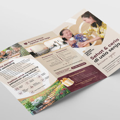
Brochures / patient education (reassuring communication)
Social templates (consistent and easy for the team to use)
Results
Improved brand consistency across print and digital materials.
Guidelines streamlined production and reduced visual inconsistency.
Communication feels calmer and more professional—aligned with a sensitive healthcare service.
Stronger perceived trust during first contact / service introduction.
My Role
I handled the project from strategic direction to a usable visual system:
Defined audience needs (seniors + family decision-makers)
Set brand attributes and visual direction
Designed the logo system and usage rules
Built the design system (color, typography, layout)
Prepared key applications and guidelines for practical rollout